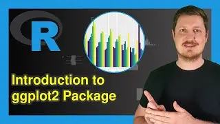
Introduction to ggplot2 Package in R | Data Visualization Tutorial for Beginners & Advanced Examples
How to draw graphics using the ggplot2 package in the R programming language. More details: https://statisticsglobe.com/ggplot2-r...
Table of contents:
00:00 - Introduction
00:42 - Grammar of Graphics & ggplot2 Layers
02:02 - Basic Application of ggplot2 Package
13:24 - Advanced Data Visualization
33:04 - Outro
R code of this video:
data <- data.frame(x = 1:9, # Create simple example data
y = c(3, 1, 4,
3, 5, 2,
1, 2, 3),
group = rep(LETTERS[1:3], each = 3))
data # Print example data
install.packages("ggplot2") # Install ggplot2 package
library("ggplot2") # Load ggplot2
ggplot(data, # Draw basic ggplot2 scatterplot
aes(x = x,
y = y)) +
geom_point()
ggplot(data, # Increase point size
aes(x = x,
y = y)) +
geom_point(size = 3)
ggplot(data, # Set colors by groups
aes(x = x,
y = y,
col = group)) +
geom_point(size = 3)
ggp_simple <- ggplot(data, # Store ggplot2 plot in data object
aes(x = x,
y = y,
col = group)) +
geom_point(size = 3)
ggp_simple + # Change x-axis limits
scale_x_continuous(limits = c(- 3, 15))
ggp_simple + # Change colors by groups
scale_color_manual(breaks = c("A", "B", "C"),
values = c("#1b98e0", "#353436", "#e32f08"))
ggp_simple + # Add multiple scale layers
scale_x_continuous(limits = c(- 3, 15)) +
scale_color_manual(breaks = c("A", "B", "C"),
values = c("#1b98e0", "#353436", "#e32f08"))
ggp_simple + # Create subplots using facet_wrap()
scale_x_continuous(limits = c(- 3, 15)) +
scale_color_manual(breaks = c("A", "B", "C"),
values = c("#1b98e0", "#353436", "#e32f08")) +
facet_wrap(group ~ .)
ggp_simple + # Change ggplot2 theme
scale_x_continuous(limits = c(- 3, 15)) +
scale_color_manual(breaks = c("A", "B", "C"),
values = c("#1b98e0", "#353436", "#e32f08")) +
facet_wrap(group ~ .) +
theme_bw()
ggp_simple + # Remove legend from plot
scale_x_continuous(limits = c(- 3, 15)) +
scale_color_manual(breaks = c("A", "B", "C"),
values = c("#1b98e0", "#353436", "#e32f08")) +
facet_wrap(group ~ .) +
theme_bw() +
theme(legend.position = "none")
ggp_simple + # Remove axis information
scale_x_continuous(limits = c(- 3, 15)) +
scale_color_manual(breaks = c("A", "B", "C"),
values = c("#1b98e0", "#353436", "#e32f08")) +
facet_wrap(group ~ .) +
theme_bw() +
theme(legend.position = "none",
axis.title.x = element_blank(),
axis.text.x = element_blank(),
axis.ticks.x = element_blank(),
axis.title.y = element_blank(),
axis.text.y = element_blank(),
axis.ticks.y = element_blank())
Please find the code for the advanced examples on the website: https://statisticsglobe.com/ggplot2-r...
Follow me on Social Media:
Facebook – Statistics Globe Page: / statisticsglobecom
Facebook – R Programming Group for Discussions & Questions: / statisticsglobe
Facebook – Python Programming Group for Discussions & Questions: / statisticsglobepython
LinkedIn – Statistics Globe Page: / statisticsglobe
LinkedIn – R Programming Group for Discussions & Questions: / 12555223
LinkedIn – Python Programming Group for Discussions & Questions: / 12673534
Twitter: / joachimschork
Music by Bensound.com
License code: UPK3JXJBTLOEWP2T
Auf dieser Seite können Sie das Online-Video Introduction to ggplot2 Package in R | Data Visualization Tutorial for Beginners & Advanced Examples mit der Dauer stunde minuten sekunde in guter Qualität ansehen, das der Benutzer Statistics Globe 04 Mai 2023 hochgeladen hat, den Link mit Freunden und Bekannten teilen, dieses Video wurde auf Youtube bereits 4,390 Mal angesehen und es wurde von 155 den Zuschauern gefallen. Viel Spaß beim Betrachtenden Zuschauern gefallen!